
Trakerr
Brand identity design, Web (Bootstrap 3.0) and UI design for Trakerr, an app intelligence platform that helps capture, track and fix errors with ease. (www.trakerr.io)

Trakerr exploration
Trakerr exploration showing the final four marks. The initial direction for color was yellow and black, but we decided to go in a different direction as you will see with the following examples

Versatility of the mark
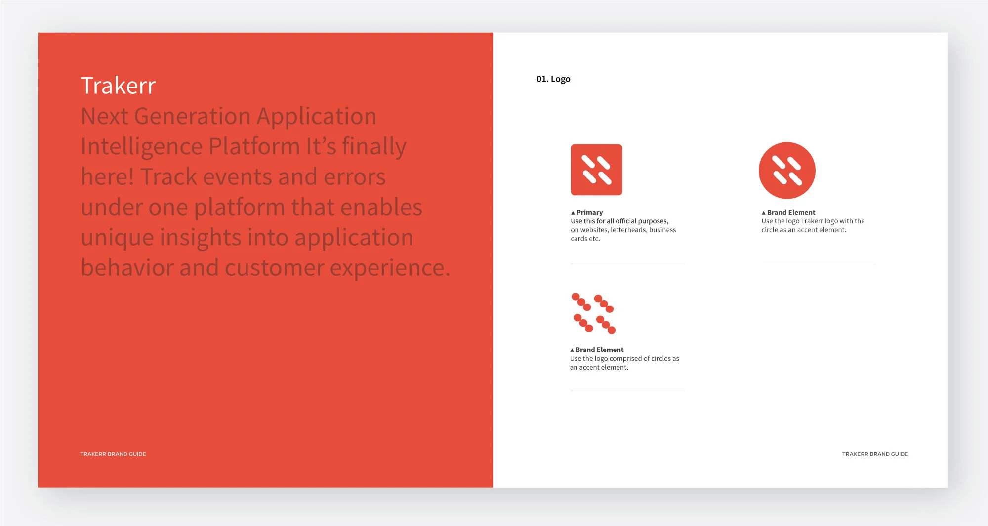
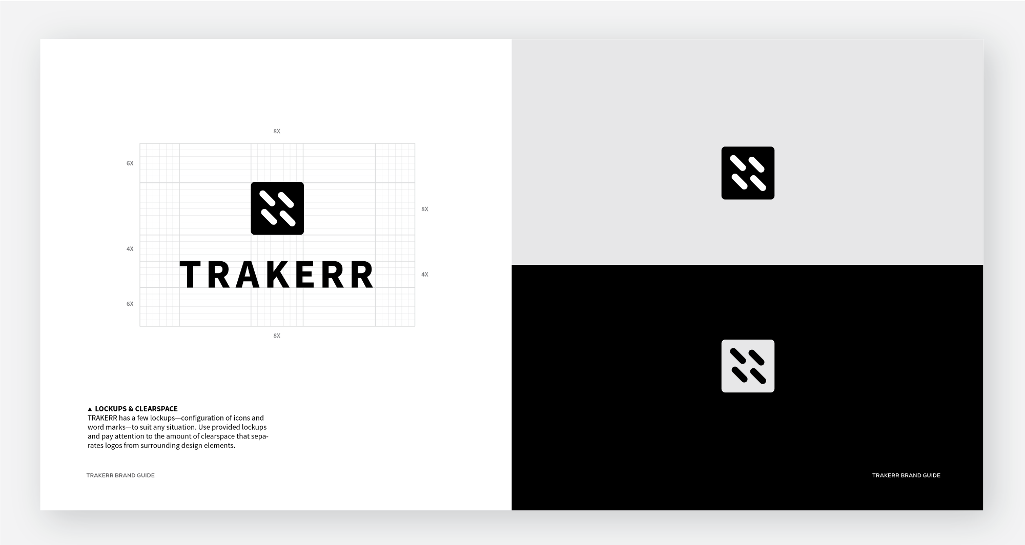
We devised two marks, a simpler one for smaller versions and a more playful one with the mark brown down into 12 circles. I thought the mark with the circles could be used as a thematic element throughout the website to add variety and increase engagement with the brand. It also had the potential to be used in an animation or as an animated element in Trakerr's UI.


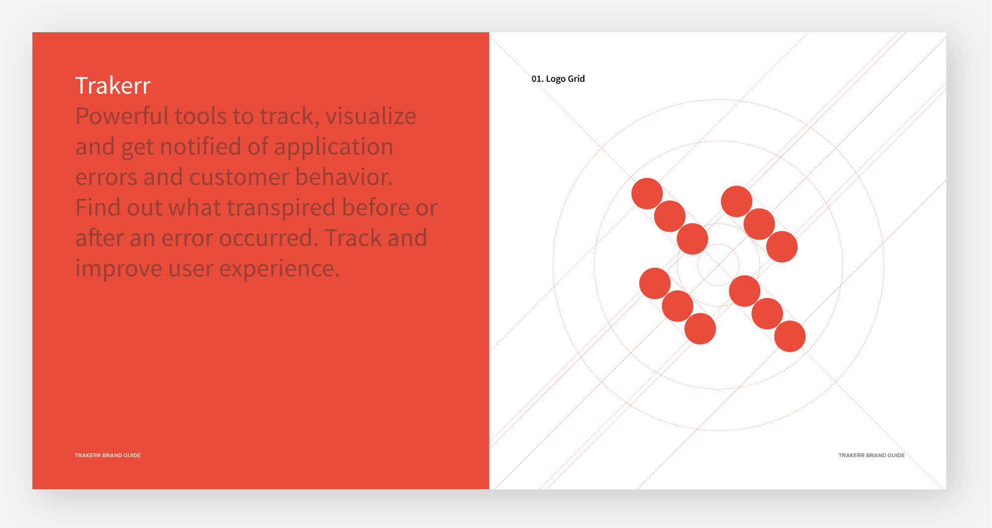
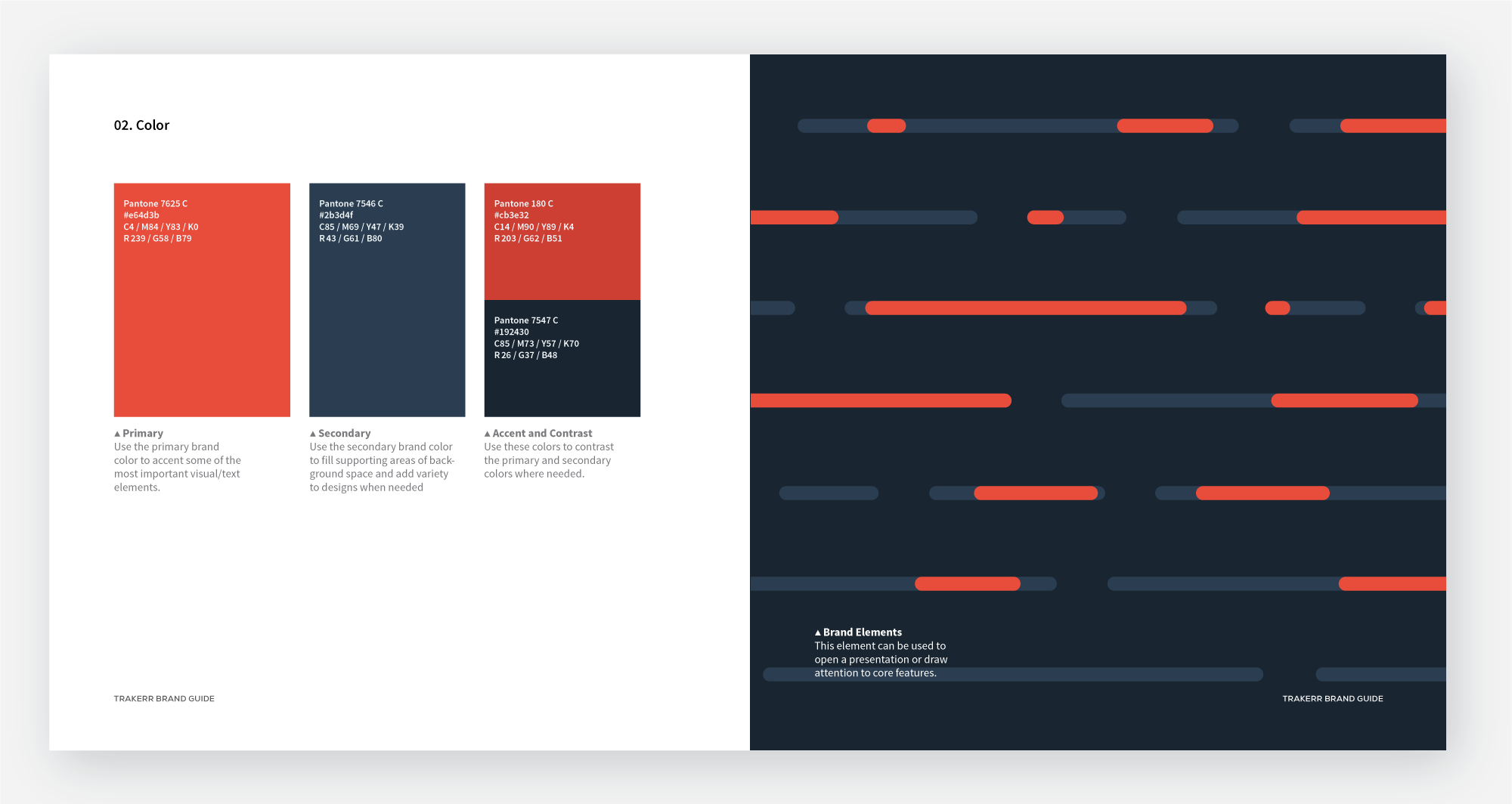
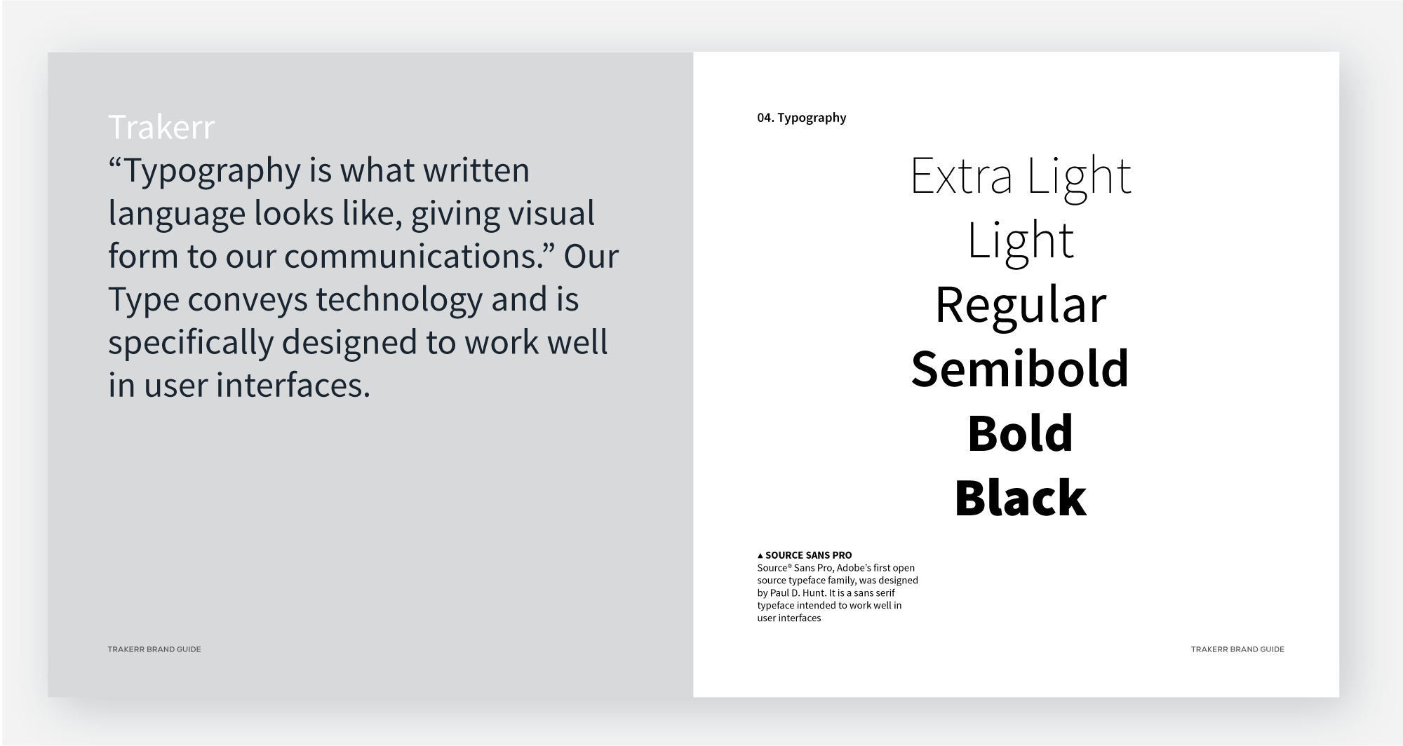
Brand Manual




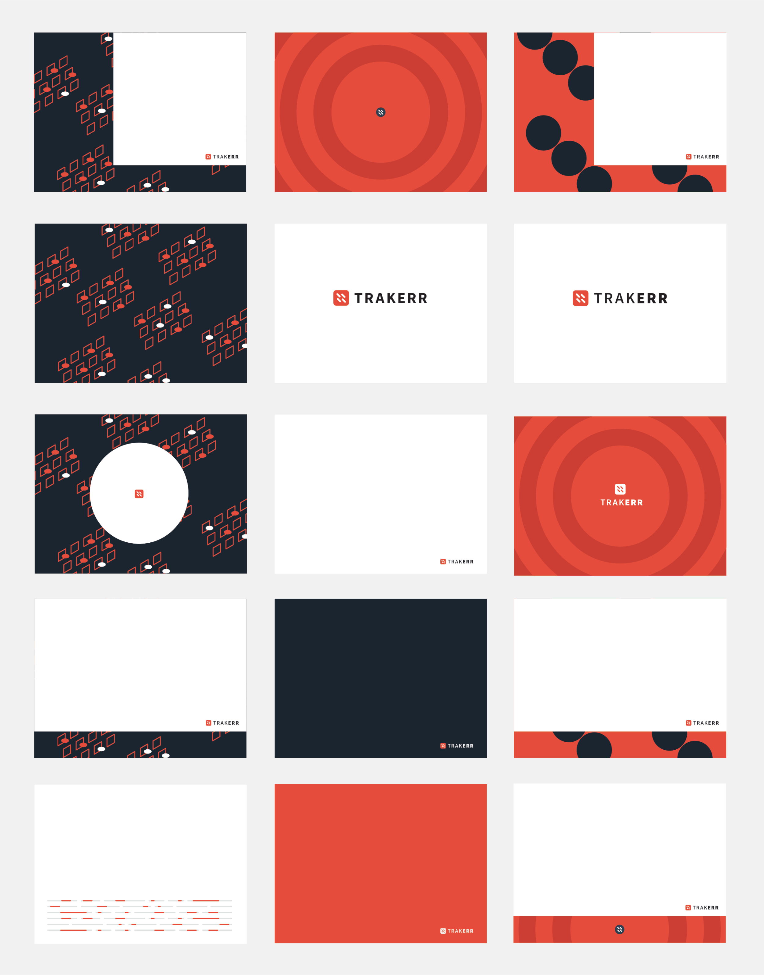
Powerpoint presentation template (above)


www.trakerr.io
Trakerr website was designed using Bootstrap 3.0, visit the site and learn about Trakerr's advanced capabilities: www.trakerr.io